Five CSS tricks used in Enyo JS Framework, and you can try them too!
Since I have joined Palm (now HP), I don’t blog frequently because working for the webOS have kept me super busy. Especially when working on the webOS 3.0 for the Touchpad tablet, I have been in multiple teams until I switched my position to commit for the Developer Relations team.
Anyway, in case you are not familiar with webOS and Enyo – webOS is a mobile platform running on Linux kernel/ webkit UI with V8 engine, so most of core apps are either written in JS and CSS, or native C/C++. And the JS framework for 3.0 is called Enyo. Basically working on the webOS framework and apps is just like developing web (in fact, I use Chrome for development). So here, I want to share some cool CSS tracks used in the framework!
1. Flexible Box Model
Enyo’s basic UI is created with using the CSS3 flexible box model.
You no longer have to worry about all the float craziness. I actually have written an article, CSS 3 Flexible Box Model and Enyo Flex Layout for webOS Developer Blog too, so please read it too!
Example:
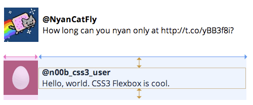
When you want to achieve a layout that has an avatar at the left, and two lines of a person’s info at the right side like this,

You can create this UI without float if the browser support flex-box:
<div class="tweet">
  <div class="tweet-avatar"><img src="avatar.png"></div>
  <div class="tweet-contents">
    <div class="tweet-username">@n00b_css3_user</div>
    <div class="tweet-text">Hello, world. CSS3 Flexbox is cool.</div>
  </div>
</div>
.tweet {
  display: -webkit-box;
  -webkit-box-orient: horizontal;
}

.tweet-contents {
  margin-left: .5em;
  display: -webkit-box;
  -webkit-box-flex: 1;
  -webkit-box-orient: vertical;
  -webkit-box-pack: center;
}
Note: this is an original spec from 2009 and this is what browsers currently support (if they do), and likely to keep supporting. I have no idea why the spec has been completely re-written recently, but so far no browsers support the new specs.
2. Root Em
There is a new unit in CSS, rem unit, which stands for “root em”. The sizing only with em could be troublesome because how it relates to the parent’s font-size. However, the rem is relative to the root, which is html.
In Enyo framework, the root font size is set to 20px. So by using rem, you can set its children font-size easily without being affected by their parents.
Here’s a comparison of em and rem:
<div class="container">
  <p class="subdue">48 minutes ago</p>
</div>
With em
html {font-size: 20px;}
.container {font-size: .8em}
.subdue {font-size: .75em} /* the font size = 12px (20 x .8 x .75) */
With rem
html {font-size: 20px;}
.container {font-size: .8em}
.subdue {font-size: .75rem} /* the font size = 15px (20 x .75) */
3. Pointer-events
This is a little obscure and simple trick not everybody has known, and a secret(?) trick I have been using since the earlier webOS framework called Mojo.
The pointer-events property was originally defined for SVG content, and later adopted as a CSS property.
For CSS, there are only two values: auto or none.
You can control the target of the mouth event, and by setting this value none, the element is no longer a target of mouse events, so when a user click the element, it pass through to its descendant during the event bubbling.
<div style="position:relative">
  <div class="overlay"></div>
  <ul>
    <li><a href="">link 1 on fading list</a></li>
    <li><a href="">link 2 on fading list</a></li>
    <li><a href="">link 3 on fading list</a></li>
  </ul>
<div>
.overlay {
  pointer-events: none;
}
The screenshots at left indicates that when the pointer-events property value is not set (default), the first link underneath of the visual overlay is not clickable, and when it is set none, the element becomes clickable (right).

The demo: http://jsfiddle.net/girlie_mac/7TvVY/
4. border-image with sprites
You have seen some demos how to use the CSS3 border-image.
But making multiple assets used for border-image is trivial because how an image needs to be “sliced” into 9 tiles with css.
However, if an each asset in the sprites only requires into 3 tiles. (For example, [static-left] [stretchable center] [static-right], and top and bottom borders are zero, you can create a single sprite image of multiple states of a button, and still be able to achieve the border-image.
.alert-button {
  /* notice the fat border-bottom */
  -webkit-border-image: url(images/alert-button.png) 0 14 111 14 repeat repeat;

  /* notice that border-top and bottom are set zero */
  border-width: 0 14px;

  /* some visual styling here */
  -webkit-box-sizing: border-box;
  height: 37px;
  line-height: 37px;
}

.alert-button:active {
  /* the fat border-top and bottom adjusted */
  -webkit-border-image: url(images/alert-button.png) 37 14 74 14 repeat repeat;
}
<img src=”/assets/images/wp-content/uploads/2011/07/border-img-button1.png” alt=”border-image demo” title=”border-img-button” width=”588” height=”574” align=”left” size-full style=”margin-right:1em” wp-image-313” />
The demo: http://jsfiddle.net/girlie_mac/89C2T/
5. Hardware acceleration
WebKit enables hardware-acceleration to render CSS 3D transforms. Although some WebKit (like webOS) may not render 3D visuals correctly, it still uses the GPU to speed up. So all you need to take advantage of this is to use the -webkit-transform CSS property!
The easiest possible way to achieve it is using translate3d instead of translate (also scale3d instead of scale), although you are not intend to make your web in 3D visual effect.
.toaster {
  -webkit-transform: translate3d(0,0,0);
}
or just set only the z-axis:
.toaster {
  -webkit-transform: translateZ(0);
}
I hope some of the stuff I just wrote are new to you!
There are more fun stuff I can write about Enyo JS framework, but I keep them for the official HP webOS Dev Blog!
Bye now!
comments powered by
