Tomomi Imura

Tomomi Imura

An Open Web advocate and front-end engineer, who loves everything mobile, and writes about HTML5, CSS, JS, UX, tech events, gadgets, etc. She unintentionally got 15min of fame by creating The HTTP Status Cats. Also, the opinions expressed here are solely her own and do not express the views or opinions of my employer.

Twitter LinkedIn Instagram Github Flickr

Creative Commons License
My articles are licensed under a Creative Commons Attribution-ShareAlike 4.0 International License.

Quick Fun: CSS3 Filter Effects

I quickly played with the brand-new CSS Filter Effects on the latest WebKit Nightly! (Edited: Now also supported on Chrome Canary 18.0.976.0 +)

Click the images to view in the full size.

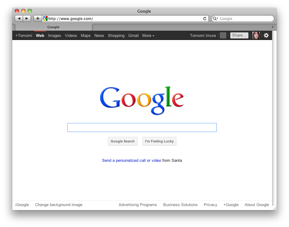
<img src=”/assets/images/wp-content/uploads/2011/12/default-300x235.png” alt=”no filter” title=”no filter” width=”300” height=”235” align=”left” size-medium wp-image-412” />
This is a default google.com screen.
No filter added.

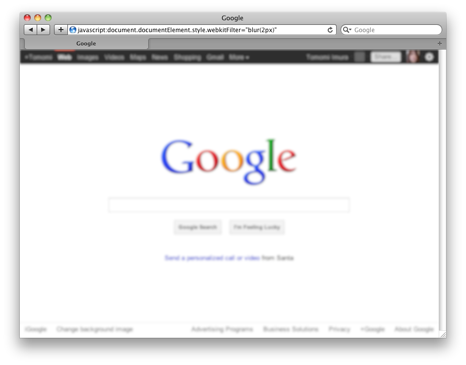
<img src=”/assets/images/wp-content/uploads/2011/12/blur-2px-300x235.png” alt=”filter:blur(2px)” title=”filter:blur(2px)” width=”300” height=”235” align=”left” size-medium wp-image-413” />
blur(radius) to create Gaussian blur

-webkit-filter: blur(2px);

The default is 0, no blur.

<img src=”/assets/images/wp-content/uploads/2011/12/brightness-30-300x235.png” alt=”filter:brightness(30%)” title=”filter:brightness(30%)” width=”300” height=”235” align=”left” size-medium wp-image-416” />
brightness(amount)

-webkit-filter: brightness(30%);

The default is 100%. Values of amount over 100% are allowed.
Updated: I am not sure when it has modified, but it seems that not the accepted value is the range between -100% (dark) and 100% (light), and the default is 0.

<img src=”/assets/images/wp-content/uploads/2011/12/contrast-30-300x235.png” alt=”filter:contrast(30%)” title=”filter:contrast(30%)” width=”300” height=”235” align=”left” size-medium wp-image-418” />
contrast(amount)

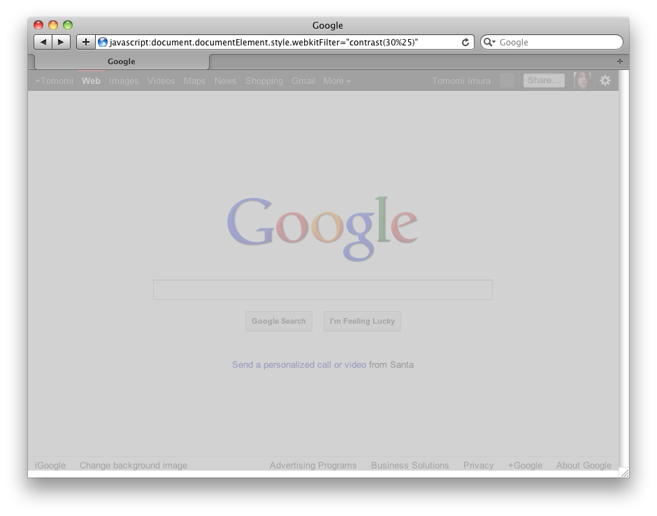
-webkit-filter: contrast(30%);

The default is 100%. Values of amount over 100% are allowed.

<img src=”/assets/images/wp-content/uploads/2011/12/grayscale-100-300x235.png” alt=”filter:grayscale(100%)” title=”filter:grayscale(100%)” width=”300” height=”235” align=”left” size-medium wp-image-419” />
grayscale(amount)

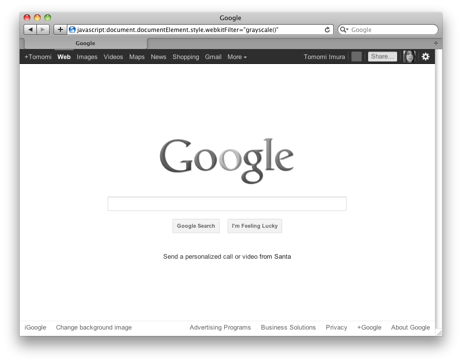
-webkit-filter: grayscale();

The default is 100%.

<img src=”/assets/images/wp-content/uploads/2011/12/sepia-100-300x235.png” alt=”filter:sepia(100%)” title=”filter:sepia(100%)” width=”300” height=”235” align=”left” size-medium wp-image-420” />
sepia(amount)

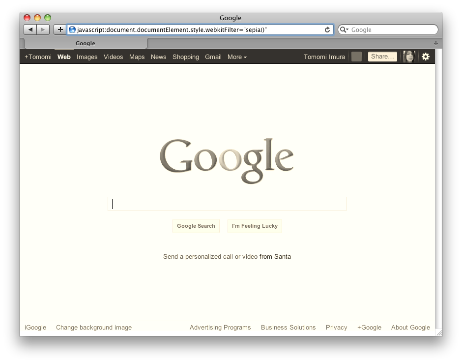
-webkit-filter: sepia();

The default is 100%.

<img src=”/assets/images/wp-content/uploads/2011/12/invert-100-300x235.png” alt=”filter:invert(100%)” title=”filter:invert(100%)” width=”300” height=”235” align=”left” size-medium wp-image-421” />
invert(amount)

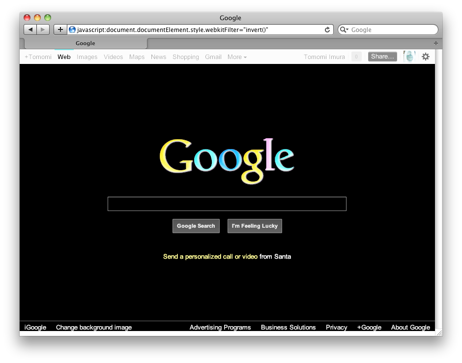
-webkit-filter: invert();

The default is 100%.

<img src=”/assets/images/wp-content/uploads/2011/12/opacity-30-300x235.png” alt=”filter:opacity(30%)” title=”filter:opacity(30%)” width=”300” height=”235” align=”left” size-medium wp-image-422” />
opacity(amount)

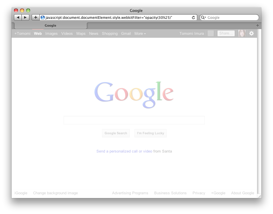
-webkit-filter: opacity(30%);

The default is 100%, no transparency.

<img src=”/assets/images/wp-content/uploads/2011/12/saturate-50-300x235.png” alt=”filter:saturate(50%)” title=”filter:saturate(50%)” width=”300” height=”235” align=”left” size-medium wp-image-423” />
Saturate(amount)

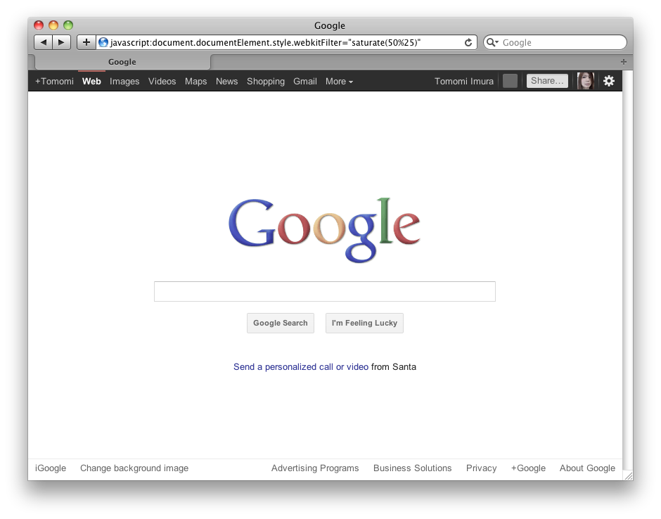
-webkit-filter: saturate(50%);

The default is 100%.

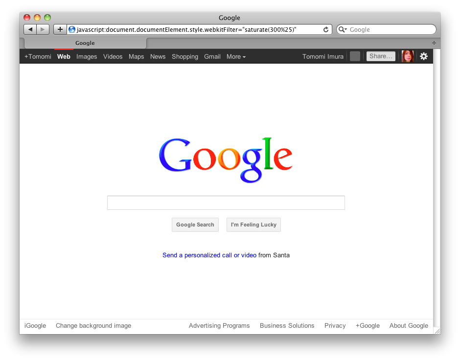
<img src=”/assets/images/wp-content/uploads/2011/12/saturate-300-300x235.png” alt=”filter:saturate(300%)” title=”filter:saturate(300%)” width=”300” height=”235” align=”left” size-medium wp-image-436” />
Saturate(amount) – the amount over 100% is also allowed.

-webkit-filter: saturate(300%);


<img src=”/assets/images/wp-content/uploads/2011/12/hue-rorate-90deg-300x235.png” alt=”filter:hue-rotate(90deg)” title=”filter:hue-rotate(90deg)” width=”300” height=”235” align=”left” size-medium wp-image-424” />
hue-rotate(angle)

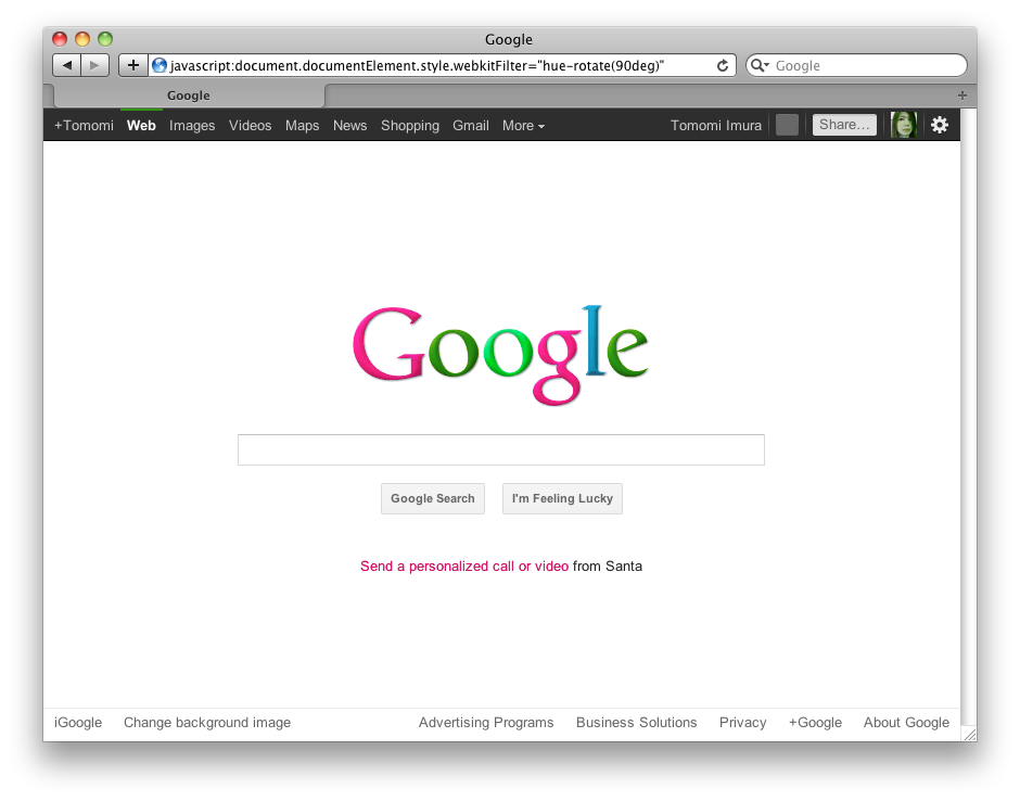
-webkit-filter: hue-rotate(90deg);

The default is 0deg.

<img src=”/assets/images/wp-content/uploads/2011/12/hue-rorate-300deg-300x235.png” alt=”filter:hue-rotate(300deg)” title=”filter:hue-rotate(300deg)” width=”300” height=”235” align=”left” size-medium wp-image-425” />
hue-rotate(angle)

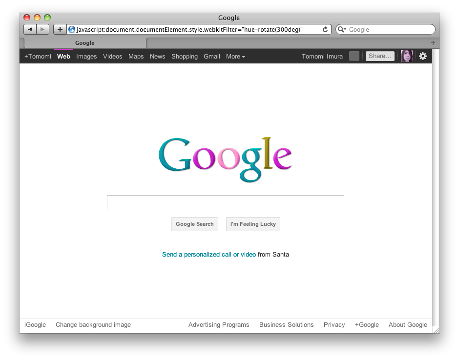
-webkit-filter: hue-rotate(300deg);


<img src=”/assets/images/wp-content/uploads/2011/12/drop-shadown-on-toolbar-300x235.png” alt=”filter:drop-shadow(…)” title=”filter:drop-shadow(…)” width=”300” height=”235” align=”left” size-medium wp-image-441” />
**drop-shadow()**

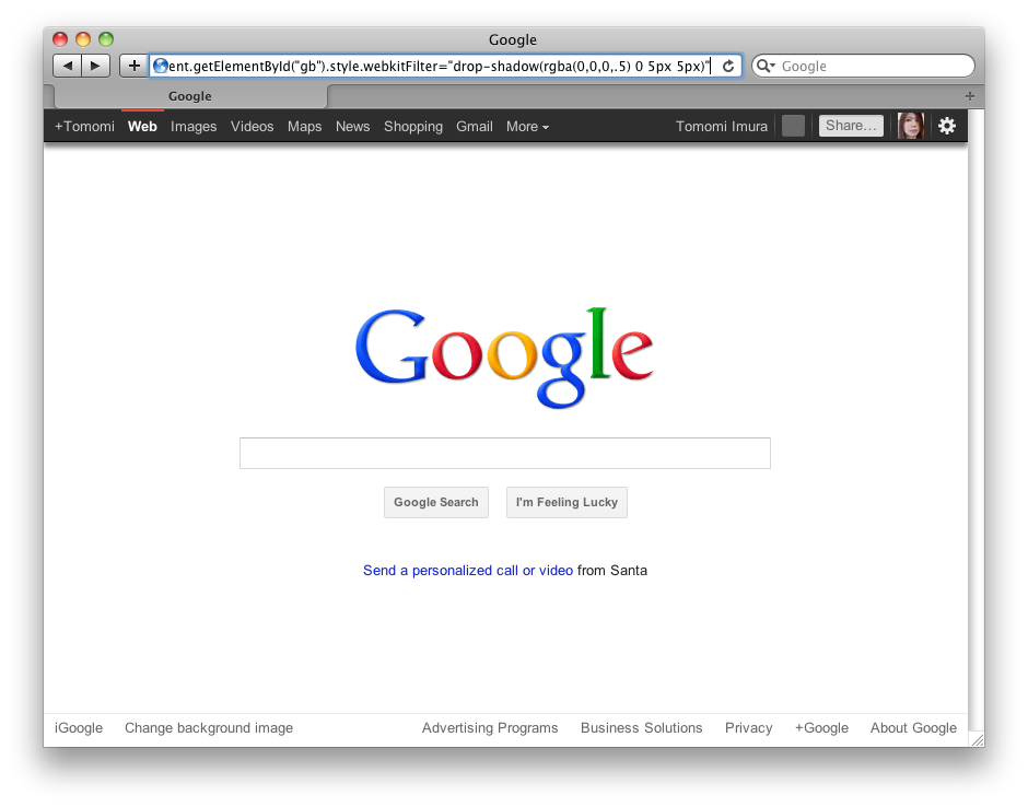
/* Adding Drop-shadow on the toolbar at the top */

#bg {
  -webkit-filter: drop-shadow(rgba(0,0,0,0.5) 0 5px 5px);
}


comments powered by