
Creating A Custom HTML5 Form Validation
Note: The article was originally written for Nokia Code Blog, with helps from Fred Patton (editor) and Andrea Trasatti (proofreading).
In his blog post on HTML5 forms and IE10 Mobile, Andrea explained HTML5 forms and what is new in Internet Exporer 10 Mobile, so you should now have some understanding of HTML5 form validation. To summarize, HTML5 eases the pain of writing extra logic to validate users’ form inputs, letting you create usable forms with a little or no scripting.
In this tutorial, I will show you a practical example of creating a custom validated form with CSS3, web fonts, and a bit of JavaScript (or not).
First of all, creating a form field with a simple empty field validation is extremely easy. All you need to do is including required attribute in <input>.
<form>
  <input type="text" required>
  <input type="submit" value="Submit">
</form>
Try this simplest form validation demo. When you attempt to submit the form with the required field empty, the supported browsers display an error indication (with message, or just a visual indication).
These are the screenshots of default error UI from IE10 (desktop) and IE10 Mobile:
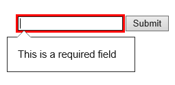
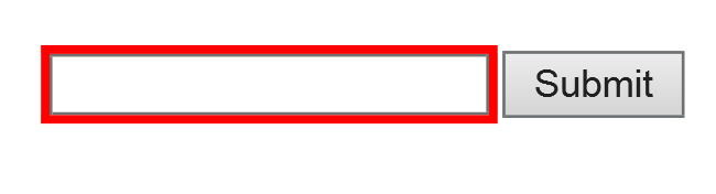
In IE10 Mobile, you do not get the “speech bubble” error message, but the field is focused with red borders while the visual keyboard is popped up, so you know the field needs attention.
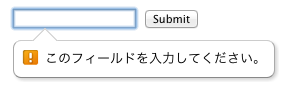
The error message text and its UI vary depending on browsers and language settings. The screenshot below is Chrome running on the MacOS with Japanese as the primary language:
OK, this looks good enough, but let’s make it more interesting by customizing it using 1) pattern matching, 2) CSS3 visual effects, and 3) custom error messages.
Pattern Matching
The pattern attribute specifies a regular expression against the control’s value. Here’s a simple regular expression to detect text that is 6 to 12 alphanumeric characters long.
<form>
  <input id="username" type="text" pattern="[a-zA-Z0-9_-]{6,12}" autofocus required>
  <input id="submit" type="submit" value="create">
</form>
Try this demo with the pattern attribute by submitting an invalid query. For example, type “123″ and hit “Create” button and see what happens.
CSS3 User Interface Selectors
There are a number of user interface state pseudo-classes in CSS. In additional to :hover, :active, etc., there are more pseudo-classes defined, such as :valid, invalid, in-range, out-of-range, required, optional, read-only and read-write.
Let’s color the field input depending on the state. The text will appear red when the entry is invalid, and green when it is valid.
:valid {
    color: green;
}
:invalid {
    color: red;
}
Try this demo to see how the CSS takes effect.
More Visual Effects with Web Font Icon
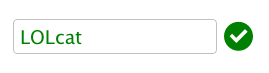
Now, we are going to display an extra visual indication with a green checkmark icon. Instead of using an image, let’s experiment with CSS3 web font capabilities.
Before proceeding, if you are not familiar with CSS3 web fonts, please read the articles linked at the end of this blog.
There are many free web fonts out there, as well as some icon fonts you can use for free. In this demo, I used the Iconic font from IcoMoon. The great thing about using IcoMoon is that the IcoMoon App lets you can choose only the icons you need to use, and package them into a lightweight file.
Once you get the web fonts, upload all the font formats in a one place somewhere on your server with your HTML files, and include the @font-face rule in your CSS file.
@font-face {
    font-family: 'iconic';
    src: url('webfonts/iconic.eot');
    src: url('webfonts/iconic.eot?#iefix') format('embedded-opentype'),
         url('webfonts/iconic.svg#iconic') format('svg'),
         url('webfonts/iconic.woff') format('woff'),
         url('webfonts/iconic.ttf') format('truetype');
    font-weight: normal;
    font-style: normal;
}
Now, using a CSS trick, add the icon when the entry is in the :valid state, with using the ::before (or ::after) pseudo-element to insert some content before (or after) the content of an element.
To display the icon after the input field, I am tempted to just use pseudo-class and pseudo-element all together like, input:valid::after, However, it is not possible to add contents to the input with the CSS, since input has no document tree content. Therefore, I needed to use an extra element after the input like this:
<input id="username" type="text" pattern="[a-zA-Z0-9_-]{6,12}" autofocus required>
<span class="icon-validation" data-icon=""></span>
In the span, I am using a data- attribute to specify which character to insert. In this case, I am using data-icon attribute to hold the special font character that I used IcoMoon to map.
:valid + .icon-validation::before {
    content: attr(data-icon);
    color: green;
}
The custom data attributes (data-*) in HTML5 is used to store a small private data and retained minimal state on DOM.
You can insert the character directly into the content property of the ::before pseudo-element in the CSS instead, however, I recommend using the data binding technique with the data-* to make your code more semantic.
Customizing the Error Text
There’s the easy way to customize the message text, and then there’s the easier way.
The easier way is adding inline text with title attribute. The text will be appended after the default error message. The screenshot below is from Opera 12:
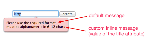
<input id="username" type="text" pattern="[a-zA-Z0-9_-]{6,12}" autofocus required
       title="must be alphanumeric in 6-12 chars">
Try this demo to see how this takes in effect.
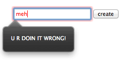
If you would like to fully customize the error message, you need a little DOM scripting help. The setCustomValidity method allows you to set a custom text by changeing the validationMessage property of the DOM node that contains the message.
When the input is checked by checkValidity method on a form element node, and found to be invalid, the invalid event is fired for the node. So you can add the event listener to check if the input is either empty or the value is mismatched.
input.addEventListener('invalid', function(e) {
    if(input.validity.valueMissing){
        e.target.setCustomValidity("PLZ CREATE A USERNAME, YO!");
    } else if(!input.validity.valid) {
        e.target.setCustomValidity("U R DOIN IT WRONG!");
    }
}, false);
This is how it looks in Firefox 16.
The validity property returns a ValidityState object, which contains properties that describe the state (boolean) of validation on an element, such as, value, valueMissing, typeMismatch, etc. (If you would like to learn more about ValidityState object, I list some links at the end of this article).
Try this demo to see how it takes effect. I also encourage you to fork the code to play with other ValidityState object states.
You can use both the JavaScript and title attribute together. Try it by yourself.
Put Them All Together
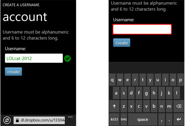
I have put together a full demo with extra styles to mimic the Windows Phone 8 UI, so try it on mobile too!

http://goo.gl/xKj0X
These is a little gotcha in IE10 mobile with the icon next to the field—it does not display until the field it unfocused, while on other browsers I have tested, it shows up immediately once the query becomes valid (in this case, when the numbers of the character hits 6).
These are actual screenshots from IE Mobile:
Learn More
- WebPlatform.org: HTML5 form features
- Dive Into HTML5: A Form of Madness
- W3C: CSS Fonts Module Level 3
- Six Revisions: The Essential Guide to @font-face
- WebPlatform.org: Pseudo-elements
- MSDN: ValidityState object
comments powered by