
More Blah Blah on Legacy Clients
Last week in New York City, I could feel the beginning of autumn. I was fortunate to be on stage at with amazing people at Google NYC office for EDGE Conference.
Unlike any other tech conferences I have attended, EDGE Conf has a unique format- each session starts with a short presentation in the beginning, then proceeds a panel discussion in a cutting edge topic. I was a one of the panelists for Legacy Clients to talk about old browsers and less capable browsers, as well as topics on progressive enhancement.
During the panel, we got fascinating audience participations, and for a moment, the panel became a hissy fit of defending/attacking Internet Explorer for a moment, and it was amusing and I was watching them while almost forgetting I was in a panel. At the same time, I realized I totally failed to express my opinions in lesser capable browsers, which are not IE.
You can watch the whole panel on YouTube.
Crappy Old Browsers
As you probably know me already, I have been in mobile field for quite a long time. I am less familiar with IE 8 and older than many of you, because there is no such thing in mobile- the oldest IE for Windows Phone is version 9. Yes, there are older IE for mobile- The older Windows Mobile came with Pocket IE (PIE), which used a different rendering engine and was nothing like the desktop equivalent. I think the last time I’ve heard the PIE was when Microsoft KIN was released (then killed instantaneously).
I have worked on thousands of mobile browsers in past (especially, when I was working for Yahoo!’s mobile sites), and thank god, there was WURFL. Back in the time, when the most popular browsers included Nokia’s S60 WebKit, Blackberry browser (pre-WebKit), Motorola Razr browser… JavaScript wasn’t really a thing for mobile. Client-side feature detection was no existent. The browser detection was all done in server-side, and the features and capabilities were pulled from the WURFL data that associated with the user-agents. Yes, there were mobile web standards like XHTML-MP, however, mobile browsers supported and implemented them poorly, and each browser behaved totally differently.
Also, the server-side manipulation was necessary for the headache-inducing error 413 (“Request entity too large”) problem. Believe or not, for example on Yahoo! News, many browsers were not even capable to display one news story because the content size was too large. To avoid this unpleasant experience to the users, the contents needed to be trimmed in server.

Screenshots of m.yahoo.com that I worked on. Awwww, nostalgia.
Crappy New Browsers Hidden within Native Apps
OK, so we don’t live in 2007 anymore. Can we forget the old mobile browsers? People upgrade their mobile phones in every one years or so, right?
Yeah.
But you know that Android stock browsers are the new IE6.
And even worse, many of the “native apps” are actually hybrid apps, or using the embedded browser (WebView, or UIWebView for iOS) intensively. For instance, a large portion of Facebook app is built on top of the web technology, using the WebView, apparently.
These embedded browsers are likely to be less capable than the actual mobile browsers installed on devices. You may be using Chrome on Android phone to browse web, but Andorid apps’ WebView is not Chrome.
The same for iOS- iOS’s UIWebView is not Safari, and it does not use the same JavaScript engine. You can’t expect the same rendering or performance on the embedded browsers.
You may not be writing native apps using WebView, but your web pages may be visited from some apps within the browsers.
Pseudo Browsers
Sure, Google Chrome for Android is a real browser, however, “Chrome” for iOS is not.
Due to the Apple’s licensing restriction for their iOS apps, Google cannot ship a real browser, but instead, they ship this Chrome-like browser, which is really just a UIWebView.
All other browsers available for iOS are pseudo-browsers as well.
Proxy Browsers
There is another type of browsers, called proxy browsers. (The marketing term is cloud-accelerated browsers). The most well-known proxy browser is probably Opera Mini. Nokia also has Nokia Xpress, which uses Gecko rendering engine in server, and Silk browser for Kindle from Amazon.
Proxy servers fetches the requested content, applies content adaptation and compression, and returns a formatted and compressed representation of the requested page to the browser client.
What great about the browsers are that they are super lightweight, can run on feature phones, saves data transfer time and cost if you pay per data, or when you are traveling, you can save the expensive roaming fee. The degree of the optimizations and compression varies – Opera Mini and Nokia Express do more aggressively (Let’s say, as much as 90% compression) than Silk.
On Opera Mini and Nokia Xpress, JavaScript and most CSS are executed on the proxy rather than the client side. For example, Accordions UX will not expand and collapse without a roundtrip to the server.
Amazon Silk execute JavaScript partially on server, partially on client-side. I have no idea how the browser determines…
You may not care about these browsers, but keep in your mind that Opera Mini has 300 million, and Nokia Xpress has 80 million active users in the world.
Popular sites like Facebook has enormous numbers of access from these browsers, especially in Asia and Africa.
While I tried to find the stats, I came across with this article, “Why Opera’s lightweight Mini browser is more popular than ever”.
Progressive Enhancement and Graceful Degradation
To design mobile web inclusively, the first thing you need to care is to determine the lowest common denominator. The core experience to serve virtually all browsers includes contents, semantic markup, and basic styling.

On top of the core experiences, you can use all the fancy pants CSS3 and JavaScript, yet your web must degrade gracefully for less capable browsers. We always should keep in mind that it is OK to fail, but just let them fail without losing any core functionality and contents. It is completely OK to not give the rounded corners to your UI objects. Your web is still functional on the less-capable browsers.
Another example of using fallback to support less-capable browsers is when you are trying to achieve responsive design, keep in mind some browsers don’t understand the media queries. so make the one with the lowest common denominator outside of the media queries.
If the UI is progressively enhanced, for instance, CSS3 gradient background is applied, make sure to set the solid color. Progressive Enhanced design should degrade gracefully too. Let’s say, you have a dark background (black to gray gradient) and white text, don’t forget to set the solid color, otherwise the background turns white (default color on most browsers), and the text is invisible on the browsers that don’t support the CSS.
Also, the idea of the progressive enhancement and graceful degradation can be applied to more than just browsers- faster connection speed and greater bandwidth allow us to serve more advanced experiences. On the other hand, when the connection speed is slow, progressive loading matters a lot. Imagine when the web page is constructed mostly by DOM manipulation and almost no markups. How painful it can be when you are waiting for some contents to load.
How about the polyfill?
I mentioned this at the conference, but it is important so I say it again- just because you can use a polyfill doesn’t mean you should. Well, actually this is a quote from Modernizer documentation. You need to think when to use polyfill wisely. Giving the same exact experience to all browsers is not always a good idea. Who cares if your button has drop shadow or not, when it is costing the performance.
Again, “Supporting” doesn’t have to mean that giving all users the same exact experiences. It is OK to give less prettier UI but must be functional. You are not working to please your designers, but your users!
I remember that we were having a discussion on polyfill by fire at JS Conf, and one drunk dude was saying “Polyfill is not a progressive enhancement but it’s an aggressive enhancement! No, wait! it is a passive-aggressive enhancement!”
LOL, but it is true, when you aggressively use polyfills, some browsers show the passive-aggressiveness by being stubborn and resisting to render in timely manner.
Ever-changing Mobile World
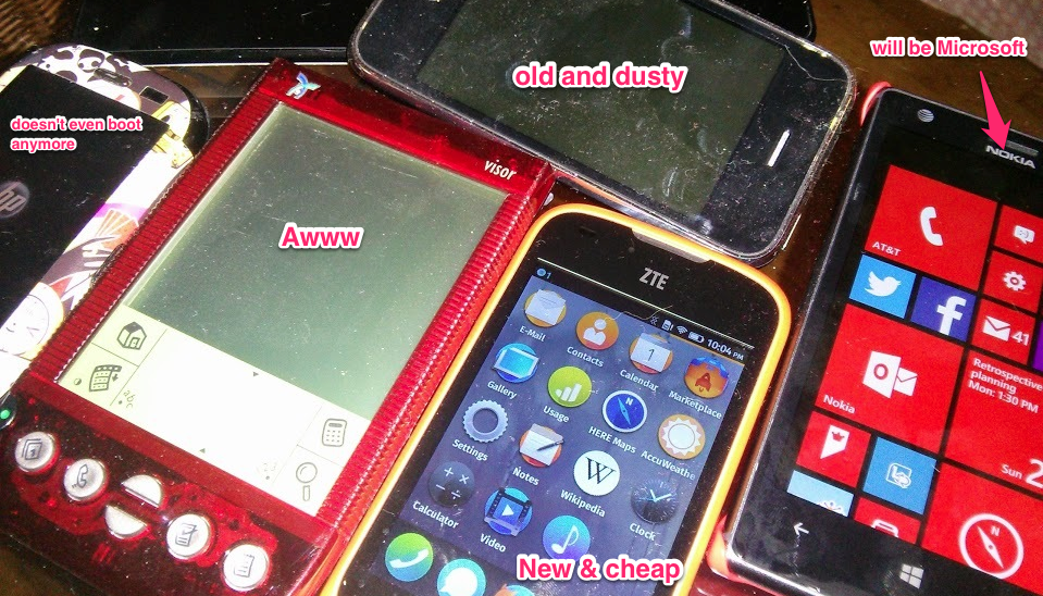
Now, I am getting nostalgic about the old mobile phones, especially things have been changed a lot these days- Motorola (Mobility) was acquired by Google, Nokia’s smart phone devision is going to be taken by Microsoft soon, and Blackberry is going private.
The mobile phone that never existed prior to 2007 are now the mainstream.
Nobody can predict what happens in mobile world in 5 years. Maybe Tesla will be making some super awesome phones with crazy fast browser. Who knows.
We need to prepare for this unknown future. We need to future-proof the mobile web.
- ← W3C Events in Tokyo – Lost in Translation, Not!
- Fluid Layout Neue – Responsive Layout with CSS3 Awesomeness →